Deleted
Joined: January 1970
Posts: 0
|
Post by Deleted on Apr 6, 2016 6:32:33 GMT
Quarters back to the original BRFC (not BMW) orientation, made by anyone. As part of the retail panel we discussed the orientation of the quarters for the concept work for this current home shirt. With our current emblem the orientation works better with white beneath it so that it can be seen easier. You can see the legibility/visibility difference between these two shirts:  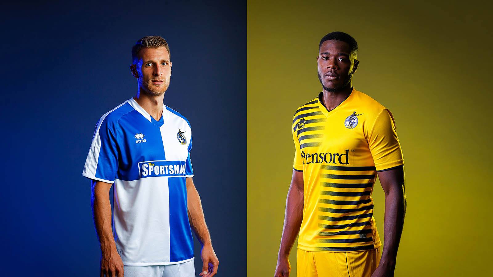 As a designer, visibility of our crest is more important than the orientation of the quarters. If our crest is ever redesigned then the quarters could flip as much as we want. It's also worth noting our orientation has flipped continuously throughout our history: www.historicalkits.co.uk/Bristol_Rovers/Bristol_Rovers.htmI looked at the link,interesting but I noticed a shirt missing,in 66 or 67 ? Rovers wore a plain blue shirt with no white trim. When I see a mistake like that I wonder how accurate the history is for the period before the first world war for instance. My favourite shirt is the blue with white trim,stick the old crest on it..lovely.
|
|
|
|
Post by Pirate Stu on Apr 6, 2016 8:21:50 GMT
Hummel. Some of the World Cup kits down the years have been a thing of sheer beauty! Are thinking of combining the quarters with the Danish 86 shirt!?!  |
|
Deleted
Joined: January 1970
Posts: 0
|
Post by Deleted on Apr 6, 2016 9:08:11 GMT
Hummel. Some of the World Cup kits down the years have been a thing of sheer beauty! Are thinking of combining the quarters with the Danish 86 shirt!?! We can dare to dream. |
|
|
|
Post by buktaboy on Apr 6, 2016 10:14:27 GMT
Quarters back to the original BRFC (not BMW) orientation, made by anyone. As part of the retail panel we discussed the orientation of the quarters for the concept work for this current home shirt. With our current emblem the orientation works better with white beneath it so that it can be seen easier. You can see the legibility/visibility difference between these two shirts: As a designer, visibility of our crest is more important than the orientation of the quarters. If our crest is ever redesigned then the quarters could flip as much as we want. It's also worth noting our orientation has flipped continuously throughout our history: www.historicalkits.co.uk/Bristol_Rovers/Bristol_Rovers.htmI much prefer the blue quarters in the top-right, bottom-left orientation. Just seems to be a stronger look. I see the point about the badge but think the quarters alone would make it clear to most footy fans exactly which team this is. |
|
Deleted
Joined: January 1970
Posts: 0
|
Post by Deleted on Apr 6, 2016 11:55:35 GMT
Hummel. Some of the World Cup kits down the years have been a thing of sheer beauty! Are thinking of combining the quarters with the Danish 86 shirt!?! View Attachment It's red. |
|
|
|
Post by Pirate Stu on Apr 6, 2016 12:49:29 GMT
Are thinking of combining the quarters with the Danish 86 shirt!?! It's red. Better?  |
|
Deleted
Joined: January 1970
Posts: 0
|
Post by Deleted on Apr 6, 2016 13:47:48 GMT
Better. Is it made of cellophane? |
|
Deleted
Joined: January 1970
Posts: 0
|
Post by Deleted on Apr 6, 2016 14:09:35 GMT
As part of the retail panel we discussed the orientation of the quarters for the concept work for this current home shirt. With our current emblem the orientation works better with white beneath it so that it can be seen easier. You can see the legibility/visibility difference between these two shirts: As a designer, visibility of our crest is more important than the orientation of the quarters. If our crest is ever redesigned then the quarters could flip as much as we want. It's also worth noting our orientation has flipped continuously throughout our history: www.historicalkits.co.uk/Bristol_Rovers/Bristol_Rovers.htmI looked at the link,interesting but I noticed a shirt missing,in 66 or 67 ? Rovers wore a plain blue shirt with no white trim. When I see a mistake like that I wonder how accurate the history is for the period before the first world war for instance. My favourite shirt is the blue with white trim,stick the old crest on it..lovely |
|
kingswood Polak
Without music life would be a mistake
Joined: May 2014
Posts: 10,263 
|
Post by kingswood Polak on Apr 6, 2016 15:22:46 GMT
As part of the retail panel we discussed the orientation of the quarters for the concept work for this current home shirt. With our current emblem the orientation works better with white beneath it so that it can be seen easier. You can see the legibility/visibility difference between these two shirts: As a designer, visibility of our crest is more important than the orientation of the quarters. If our crest is ever redesigned then the quarters could flip as much as we want. It's also worth noting our orientation has flipped continuously throughout our history: www.historicalkits.co.uk/Bristol_Rovers/Bristol_Rovers.htmI looked at the link,interesting but I noticed a shirt missing,in 66 or 67 ? Rovers wore a plain blue shirt with no white trim. When I see a mistake like that I wonder how accurate the history is for the period before the first world war for instance. My favourite shirt is the blue with white trim,stick the old crest on it..lovely.
Glad I am not the only one. I think that, for me, it's because it was just the first kit I saw us in although I had somehow managed to believe we did have the old City of Bristol crest on it lol |
|
bs10er
Joined: June 2014
Posts: 51 
|
Post by bs10er on Apr 6, 2016 17:37:44 GMT
Saw on a online competition site today,Millwall are offering a prize to the Errea factory in Palma and a free away shirt to the winner of their design next seasons Millwall away shirt.
|
|
bs14gas
Robin. S. Layer
Joined: May 2014
Posts: 462
|
Post by bs14gas on Apr 7, 2016 7:12:52 GMT
Saw on a online competition site today,Millwall are offering a prize to the Errea factory in Palma and a free away shirt to the winner of their design next seasons Millwall away shirt. Bummer if their kit was Umbro! |
|
|
|
Post by Pirate Stu on Apr 7, 2016 8:47:01 GMT
Better. Is it made of cellophane? God knows, I expect it's illegal now! Great sponsor too. |
|
Deleted
Joined: January 1970
Posts: 0
|
Post by Deleted on Apr 13, 2016 19:25:55 GMT
Macron maybe??
|
|


